
 Step two semi-complete! After finishing my edits on Papa Zulu, I have gone ahead and ordered a proof copy so that my darling wife (i.e. chief editor) can give it a second pass. I’ve also sent the PDF off to my beta readers/other editors, so they too can tell me exactly what’s wrong with it and why I should stick to writing and avoid proofreading.
And while I was working on that, I fashioned a cover for the third book. All this work on book II, as expected, has gotten the ball rolling on book III. And as always, I feel the need to visualize the end product, even before I’ve committed to writing the manuscript. Once again, I’ve gone with a cover image from Shutterstock, which now provides the bulk of my cover art.
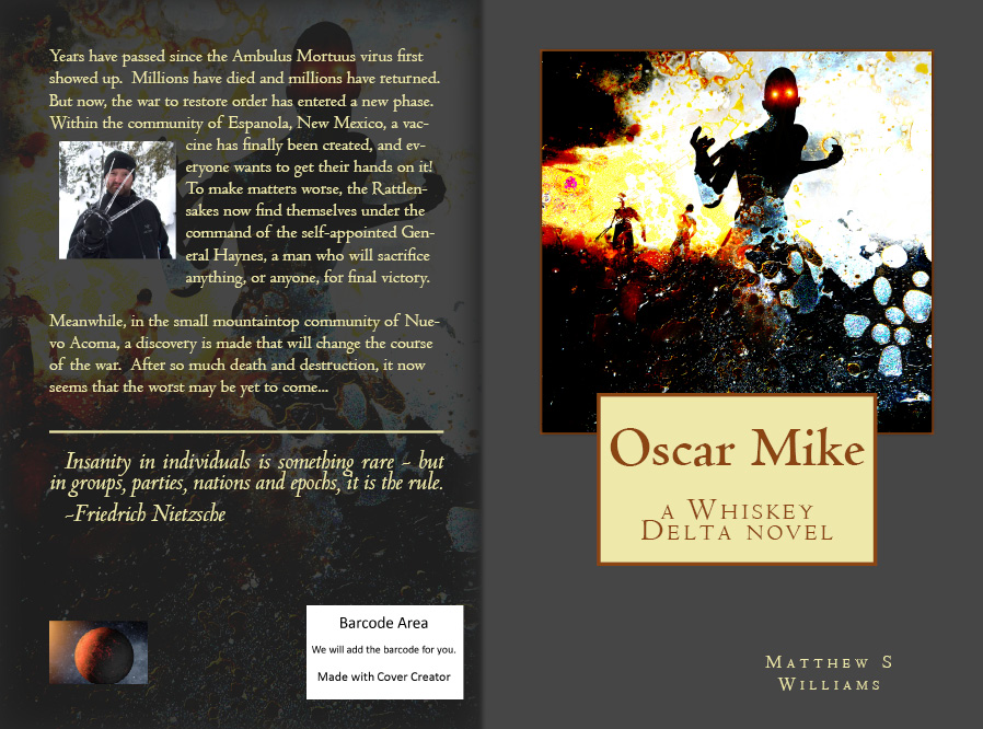 What do you think? Too much green going on here? I really like this cover template because of the solid front cover, the watermarked back, and the balance created by the text boxes, images, and quote section. Can’t wait to get moving on that one too! I hope to augment as time goes on with more favorable reviews, which is what I did with the jacket for book II.
Good luck to all us indie writers! May the sales be plentiful, the reviews favorable, and the inspiration unending!

I kind of like the Oscar Mike cover. Maybe it is a little too green, but I think it gets across the point that it’s a zombie story.
By the way, I’m still waiting for a review on The Quiet Game, Matt.
I’ll do it this afternoooooon! Or, soon enough. Almost done…
I can’t wait to hear what you have to say!
What do you think of the grey and green cover?
I think it’s pretty cool. You should keep it. It looks professional.
I like the cover! I’d say make your name bigger, though — if I can barely read it now, I wouldn’t have a hope of reading it in thumbnail form 🙂 (Note: the cover would be in thumbnail form, not me. That would be strange. Then I’d have to change my name to Thumbellina and marry a fairy prince and … actually, that wouldn’t be half bad. Let’s do that!)
You are a strange and delightful person!
Aww, thank you!
Alright, working on making my name bigger, though I think that’s the largest one available for that format. Is it just a size thing, or a font thing too?
Umm … just the size, really. I could make out what it said, it was just that it was very small.
Damn, I’ll need to reformat entirely to make it bigger. Dang thing doesn’t allow you to tweek the size or make it bold.
I’m not sure what program you’re using, but a really good one I’ve found (a free version of Illustrator) is called Inkscape, and it works pretty well for ebook cover creation.
It’s Createspace, but I will check out this other one. It might be nice to have a platform that doesn’t rule out publication with other sources.