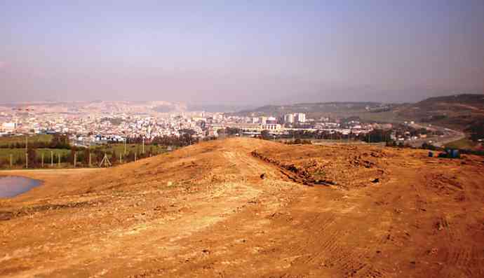
Climate Change means more than just on average hotter temperatures year round. There are also numerous consequences for sea levels, glaciers, weather patterns, weather stability, crop growth, fisheries, wildlife, forest fires, disease, parasites, rivers and fresh water tables. Explaining it can be a challenge, which is why visual tools like tables, maps and charts are so very useful.
Unfortunately, these too can seem bland and technocratic, and fail to capture the true extent and critical nature of Climate Change. Luckily, this past summer, a season that has been marked by uncharacteristically cool and hot temperatures, two particularly useful visual aids have been produced that seek to remedy this. By combining data-driven predictions with aids that are both personal and global in outlook, they bring the consequences of Climate Change home.
 The first is known as 1001 Blistering Future Summers, a tool produced by the Princeton-based research and journalist organization Climate Central. This interactive map illustrates much hotter summers will become by the end of the century if nothing is done to stem global warming. Users simply type in the name of their hometown and the map compares current temperatures in their town to how high they will be and finds the geographic equivalent.
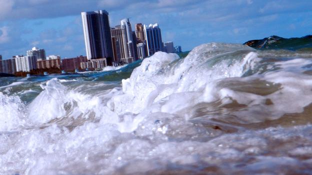
On average, according to Climate Central, daytime summer temperatures will be 4 to 6° Celsius (7 to 10° Fahrenheit) warmer across U.S. cities. That translates to most cities in the U.S. feeling like Florida or Texas feel in the summer today. For example, in the future, Boston will feel like North Miami Beach. And Las Vegas, where temperatures are projected to an average of 111 degrees, will feel more like Saudi Arabia.
 As you can imagine, changes like these will have drastic effects that go far beyond scorching summers and inflated AC bills. Furthermore, when one considers the changes in a global context, and they will be disproportionately felt, they become even more disconcerting. And that is where the series of maps, collectively known as the “human dynamics of climate change”, come into play.
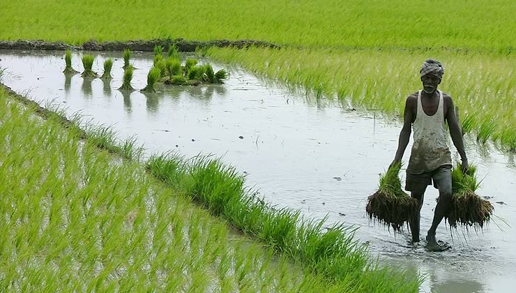
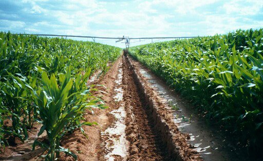
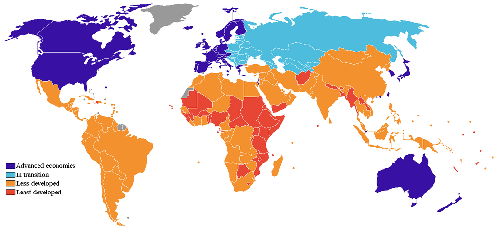
Developed by the U.K. Met Office (the official British weather forecast service) with the U.K. Foreign Office and several universities, they start with a “present-day” picture map – which shows trade in various commodities (wheat, maize, etc), important areas for fishing, routes for shipping and air freight, and regions with high degrees of water stress and political fragility.
 Then the maps get into specific issues, based on climate forecasts for 2100 that assume that nothing will be done to stop global warming. You can see, for example, how higher temperatures could increase demand for irrigation water; how parts of the world could see increases and decreases in water run-off into rivers; how different areas are set for more flooding; and how the warmest days in Europe, parts of Asia, and North America are projected to be 6°C warmer.
The poster also has summaries for each region of the world. North Africa, for instance, “is projected to see some of the largest increases in the number of drought days and decreases in average annual water run-off.” North America, meanwhile, is forecast to see an increase in the number of drought days, increasing temperatures on its warmest days, and, depending on the region, both increases and decreases in river flooding.
 The overall impression is one of flux, with changing temperatures also resulting in vast changes to systems that human beings heavily rely on. This is the most frightening aspect of Climate Change, since it will mean that governments around the world will be forced to cooperate extensively to adapt to changes and make do with less. And in most cases, the odds of this aren’t good.
For instance,the Indu River, a major waterway that provides Pakistan and India with extensive irrigation, originates in Pakistan. Should this country choose to board the river to get more use out of its waters, India would certainly attempt to intervene to prevent the loss of precious water flowing to their farmers down river. This scenario would very easily escalate into full-scale war, with nuclear arsenals coming into play.
 The Yangtze, China’s greatest river, similarly originates in territory that the country considers unstable – i.e. the Tibetan Plateau. Should water from this river prove scarcer in the future, control and repression surrounding its source is likely to increase. And when one considers that the Arab Spring was in large part motivated by food price spikes in 2010 – itself the result of Climate Change – the potential for incendiary action becomes increasingly clear.
And Europe is also likely experience significant changes due to the melting of the Greenland’s glaciers. With runoff from these glaciers bleeding into the North Atlantic, the Gulf Stream will be disrupted, resulting in Europe experiencing a string of very cold winters and dry summers. This in turn is likely to have a drastic effect on Europe’s food production, with predictable social and economic consequences.
Getting people to understand this is difficult, since most crises don’t seem real until they are upon us. However, the more we can drive home the consequences by putting into a personal, relatable format – not to mention a big-picture format – the more we can expect people to make informed choices and changes.
Sources: fastcoexist.com, (2), climatecentral.org, metoffice.gov.uk