
 Hey all! Its been a busy season thus far, and after many months of slow progress, the editing process for Papa Zulu is just about over. Which means its time for me to start picking out cover designs! Recently, I tinkered with the write-up and then added some of the more recent reviews (these would be the five star ones I’ve been going on and one about lately!). Here’s how it reads:
“Men rise from one ambition to another: first, they seek to secure themselves against attack, and then they attack others.”
–Niccolo Machiavelli
In the barren deserts of New Mexico, the war against the Whiskey Delta continues. After years of fighting, the “Mage” and his Rattlesnakes have managed to get the upper hand on the undead, while back at their base, “Doc” Ross Cooper and his team are getting close to producing a vaccine from the Patient Zero strain. But things quickly change when a new opponent enters the arena. Ever since their encounter with rogue forces in LA, the Mage has worried that there are military forces back East, people who owe allegiance to another master and want the Patient Zero strain for themselves…
Praise for Whiskey Delta:
“This was an excellent book from start to finish.” -K.C. Williams
“Great story about soldiers doing solider business.” -John
“This was an absolutely fantastic read. Highly recommend for any fan of the zombie genre.” -Britanny
“This is a badass Zombie book.” -Kellie H.
“I could not put Whiskey Delta down till the end.” – W.M. Morgan
“This book is for all those zombie fans out there!” -The Pragmatic Procrastinator
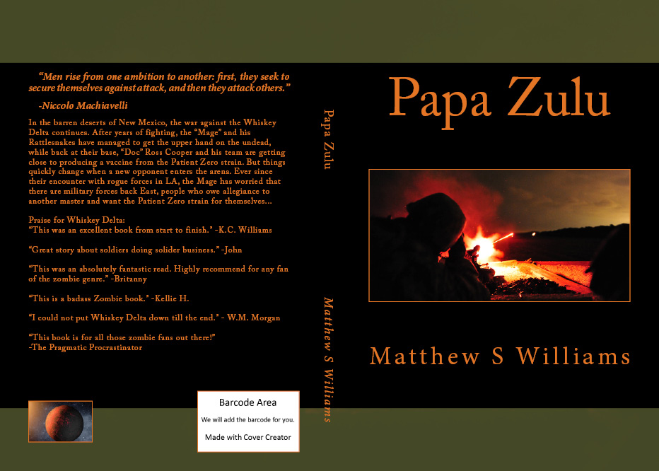
As for the design itself, I’m a little torn between two contenders. For awhile now, I’ve been working with one that boasts olive borders, orange font, black background, and the photo of a soldier firing tracers into the night. That would be this one:
 But recently I came upon another cool photo and began designing a new cover around it. Much like the other one, it’s an army stock photo, but this one shows a group of soldiers conducting live fire drills during the night. Using high-speed photo, it looks like an eye=popping laser show. Now here’s what that design looks like:
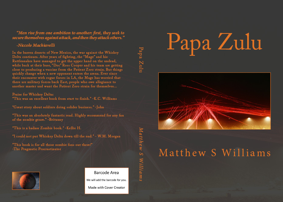
What I also like about this one is the way the photo is watermarked into the background. The red tracers are really quite impressive, and the orange font still seems to work since there are traces of orange here too. But dangit if that black and olive pattern from the first one doesn’t still seem totally appropriate, not to mention the way the orange font and black background just blend with the photo!
So I’ve decided to crowdsource this one with a poll. Which shall it be? Cast your vote and help me determine what the sequel to Whiskey Delta is going to look like.

I like the second one. It looks cool.
I’m going for the first cover. More befitting the subject. Awesome job either way Matt.