I feel fortunate that I am able to make good news posts these days. In the past few years, I have generally left bad news alone and otherwise posted nothing. I think we can all agree that that is NO WAY to run a website! Not when reader engagement is all about having things to say. So with that in mind, I have some very positive news. After nearly eight years of tinkering, my story Transverse is finally nearing completion!
I’ve been jazzed about this since I finished Part II of this three-act play a few short months ago. And as of the writing of this post, I am over 49,000 words in and just a few chapters shy of completion. While I am tempted to issue some well-deserved thanks yous and “I couldn’t have possibly done this without the support of” statements, it’s customary to leave that until the end. But trust me, those who helped out along the way know who they are and WILL be getting their mentions.
Transverse began several years ago, as I was plotting the story for my first true hard SF novel, The Cronian Incident. From the beginning, I wanted to write a story that would be part of a series, and I knew that it would begin in the Solar System. But I always hoped to expand it into the interstellar realm at some point. It was just the next logical step, really. I also wanted to get into some truly deep Fermi Paradox stuff eventually (i.e., Aliens!).
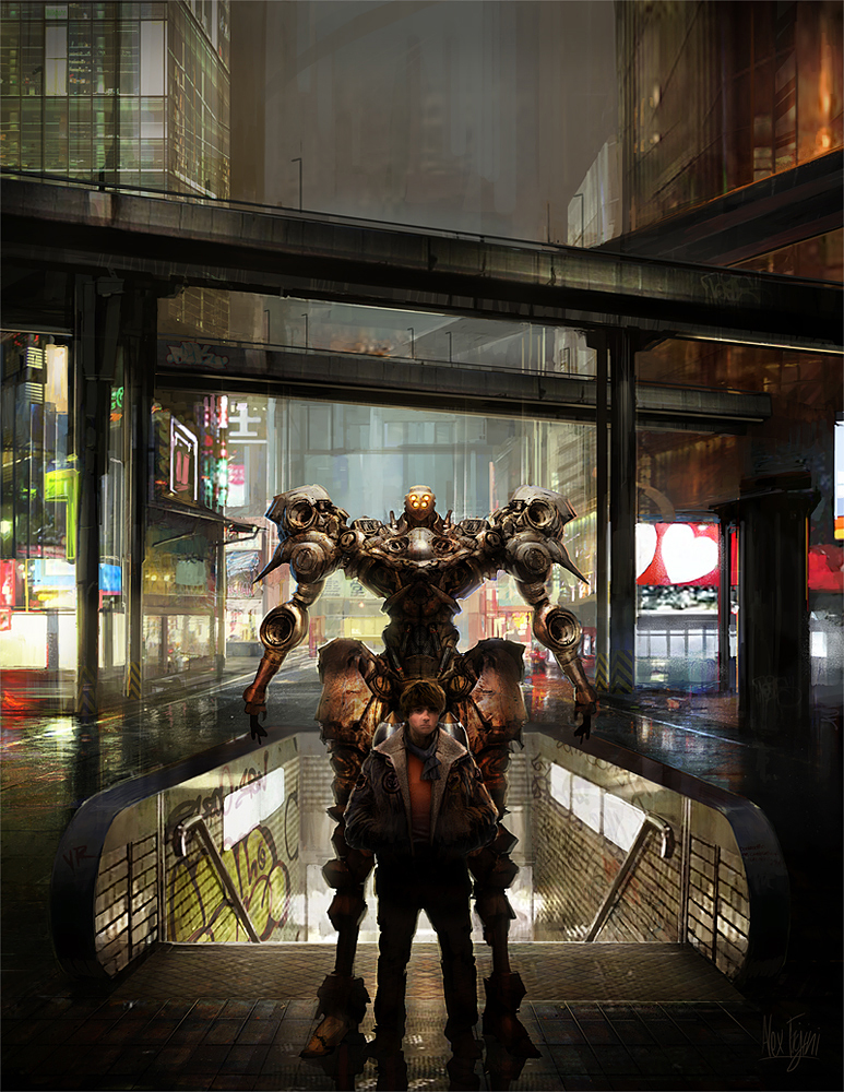
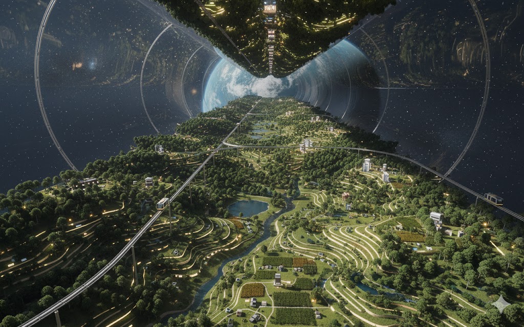
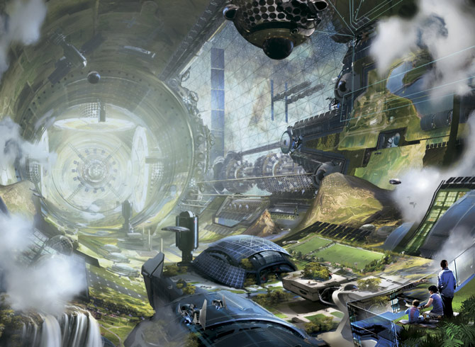
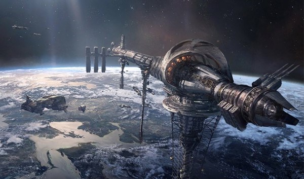
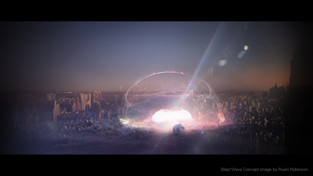
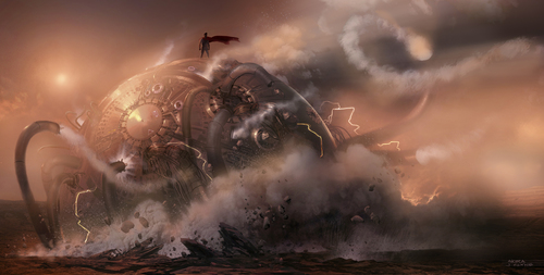
Transverse is also important as far as the whole series is concerned because it serves as the standalone-bridge novel that connects my first trilogy – The Formist Series – to subsequent trilogies. The next one will either be called the Seedling Series or the Dysonist Series, haven’t decided yet. But I promise to keep you posted. In the meantime, here’s some AI art that helps capture the spirit of my soon-to-be-finished novel!


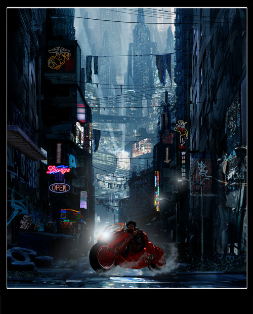
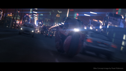
 A few years ago, it was reported that director Ruairi Robinson was going to create a live-action American adaptation of the classic anime, Akira! The project has getting a lot of hype, despite what many hardcore fans have to say about an American version of the anime cult classic. And while the attempts to get the ball rolling have continually stalled, with actors and directors constantly dropping and out of the project, it does seem like this is one project that just wont’ die.
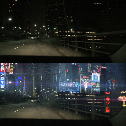
 Kaneda, (middle) Travis, (right) Cyrus") In many of these, you can see Kaneda’s iconic red bike running through the streets. But the larger focus is on the colorful skylines, complete with skyscrapers, neon signs, multiple languages scripts, and a general gritty, cyberpunk feel. And at the bottom, there is a comparison shot showing a shooting location in New York City above a picture of what the proposed Neo-New York City would look like. That name sound at all believable to you?
In many of these, you can see Kaneda’s iconic red bike running through the streets. But the larger focus is on the colorful skylines, complete with skyscrapers, neon signs, multiple languages scripts, and a general gritty, cyberpunk feel. And at the bottom, there is a comparison shot showing a shooting location in New York City above a picture of what the proposed Neo-New York City would look like. That name sound at all believable to you?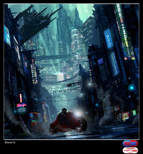


 But what montage of Akira-related images would be complete without scenes depicting the unleashed psychic Tetsuo, demonstrated his newfound powers? Below are a couple that demonstrate the anime’s antagonist in action, in the first, deflecting a missile attack from an attack chopper, and in the second breaking into the Akira vault and discovering the namesake’s remains.
 Not too bad to look at. But with the supposed director, producers, and actors changing every few years, many are wondering if this live-action remake will ever happen. And many fans can see nothing wrong with the idea, provided it is true to the source material. And dropping the whole Americanized angle and setting it back in Neo-Tokyo where it belongs wouldn’t hurt much either! But in the end, it really comes down to being true to the spirit of the Manga, if not the precise format.