
 When it comes to populations and environmental problems, cities are at the very heart of the issue. Not only are they where the majority of humanity lives, a reality which will only get worse as time goes on, they are also the source of most of our pollution, waste, and land use. People require space to live and work, as well as food, water and
Last year, the world’s population increased to 7 billion, which represents a seven-fold increase in the space of the last two centuries. What’s more, the proportion of people living in urban centers (as opposed to rural) shot up from 3% to almost half of the world’s people. This rate of population growth and redistribution is unprecedented, and is not likely to slow down anytime soon.
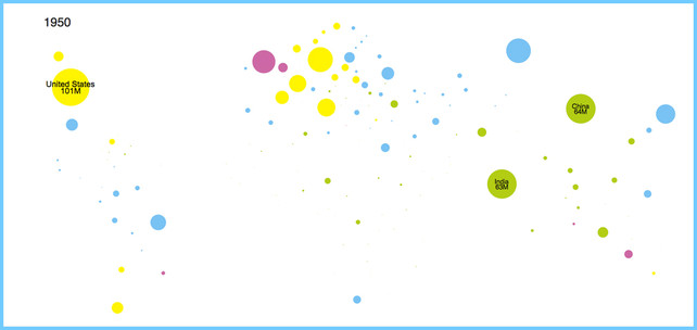 Consider the following series of infographics which were released by Unicef with the help of the design studio Periscopic. Titled “An Urban World”, they illustrate the issues of population growth and distribution. This interactive, HTML5 visualization of the world covers the years of 1950-2050. But rather than showing our geographic boundaries, every country* is depicted only by their population living in urban environments.
As you can see, each country is represented by a circle that depicts the number of people living in urban environments. As these populations grow, the circles get bigger. And as urban populations get more dense, the circles shift from green to blue to yellow to fuchsia. Immediately, a glaring fact is made clear: the problem is getting worse and at an alarming rate.
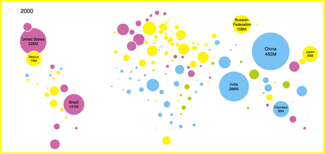 In addition, there are several nuggets of info which are staggering and particularly worrisome. For example, by 2050, both China and India will have about a billion people living in cities alone. In addition, since the 1990s, more than 75% of the U.S. population has lived in cities. At one time, the US was an outlier in this regard, but found ourselves joined over the next two decades by France, Spain, the U.K., Mexico, Korea, Australia, and Brazil.
But of course, this growth need not be a bad thing. When all is said and done, humanity has a choice. One the one hand, these megacities can take the form of smartly scaled communities of loosely populated expanses and efficient agriculture. On the other, they could easily take the form of urban slums and underdeveloped countrysides that are stricken by poverty and filthy.
 It’s a complex issue, no doubt about it, especially when you consider the flip side to the whole equation. As the saying goes, every new life means a new mouth to feed, but also a pair of working hands. What’s more, studies have shown that people living in cities tend to be far more energy efficient, and that energy surplus is usually directed toward more and more technological growth and innovation.
Seen in this light, the massive cities of the future could be hubs for the ongoing development of new energies and creative living solutions. And with more people living in large, connected, interdependent environments, the more business startups, ideas, and contributions were likely to get. Part of the reason we have seen so much progress in solar, piezoelectric motors, and bio-electricity is because of this trend. More growth will conversely mean more clean energy.
 Quite the paradox, really. Who knew people could be both the cause and solution to the world’s worst problem! In the meantime, feel free to head on over to the Unicef site and watch this interactive infographic. Just press play, and watch the cities of the world swell at the edges, competing for room on the page as they compete for room on this planet.
Also, be sure to take a gander at this infographic from BBC Future that demonstrates the current population of the world’s major cities per square meter, the projected population per square meter by 2050, and the livability rating of the city in question. They even provide some context at the bottom by showing the size of relative spaces – from prison cells to Olympic swimming pools, and comparing that to the average space an urban dweller enjoys.

Sources: bbc.com, fastcodesign.com, unicef.org
